Engaging employees in health & wellness
EMPLOYEE HEALTH PORTAL DESIGN
Client: Bridgecrest Medical | Length: 3 weeks | Collaborator: Leslie Forman
THE COMPANY:
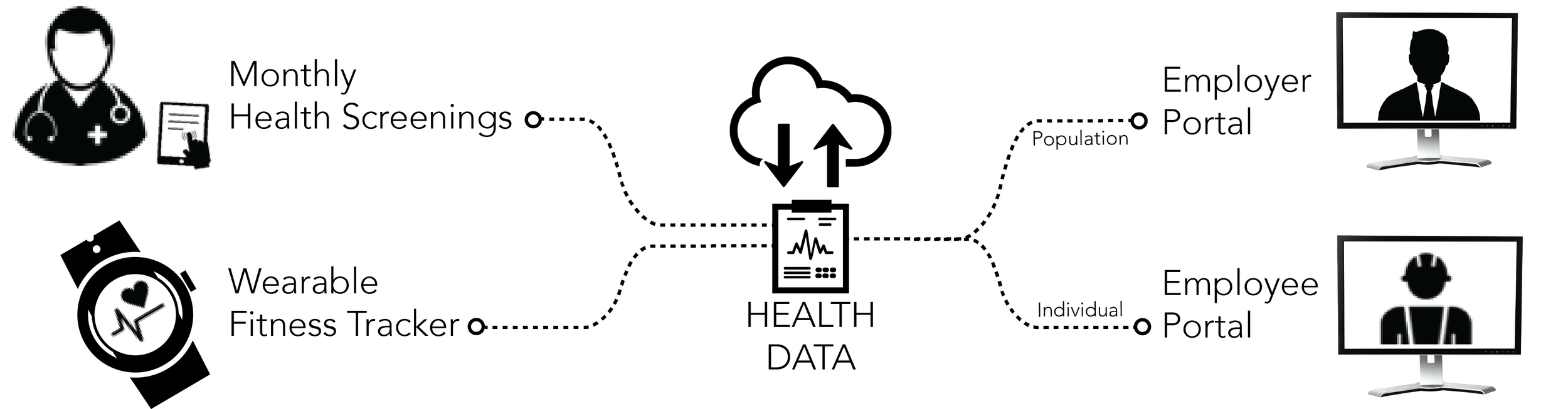
Bridgecrest offers mobile health solutions to track employee health and safety in mining and oil & gas industries. Their health care analytics system can be used to improve employee health & safety while also lowering healthcare costs associated with accidents, poor wellness, and hazardous working conditions in remote locations.
TOOLS: Omnigraffle, Invision app, Illustrator
THE CHALLENGE:
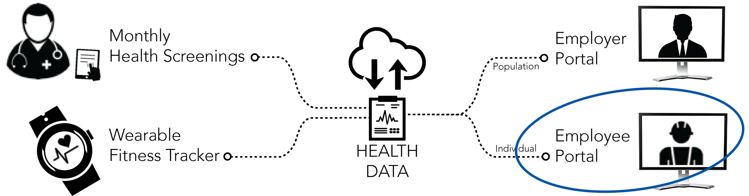
My partner and I were tasked with designing a web-based interface for workers to monitor their own health metrics. Currently, this functionality does not exist.
The ultimate goal of the health portal is to encourage workers to engage in a healthy life style and to make positive behavior changes.
OUR SOLUTION:
We designed an interface that focuses on communicating health data while increasing awareness & knowledge. We focused our design around 4 key attributes: Guided, Informative, Practical, & Motivating. Ultimately, we delivered our research findings, user flows, annotated wireframes, mobile considerations, strategy recommendations, and an interactive prototype.
RESEARCH
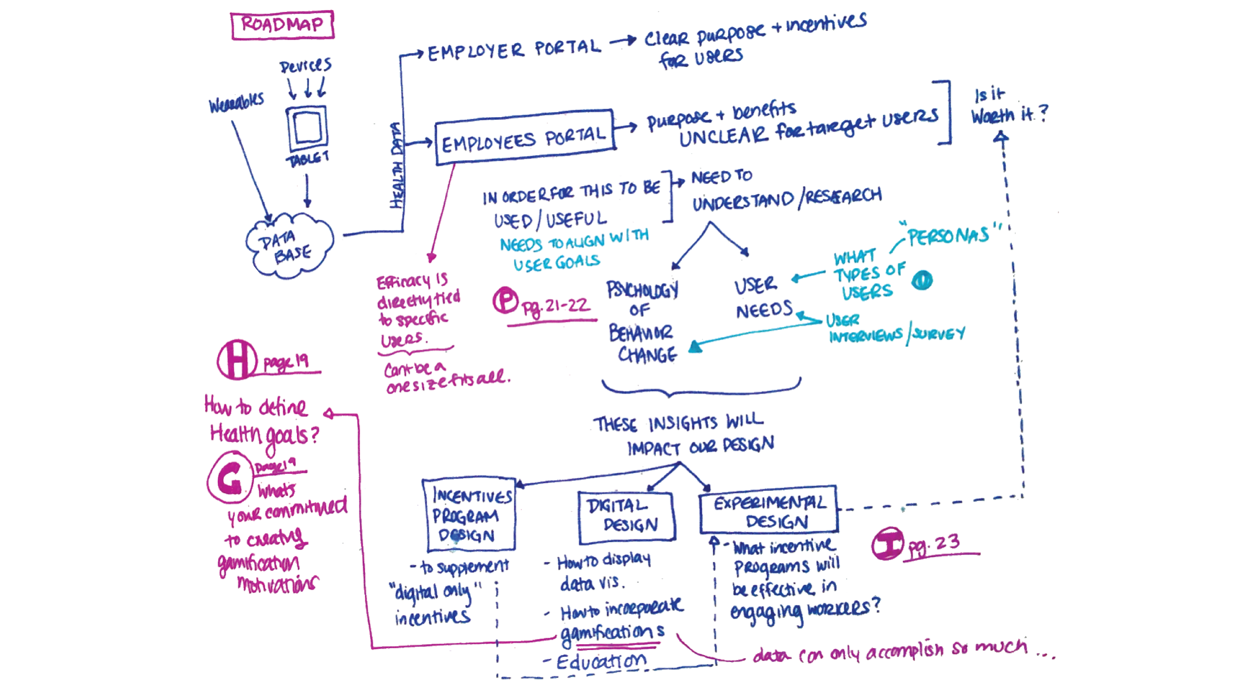
Our first step was to understand Bridgecrest's current system and strategy and how the employee portal fits into the overall business goals. We quickly realized that the challenge we were tasked with is a common one faced by anyone trying to get healthy - the challenge of motivating behavior change. Clients of Bridgecrest have clear incentives for keeping their employees healthy - but what motivates the employees to make difficult lifestyle changes?
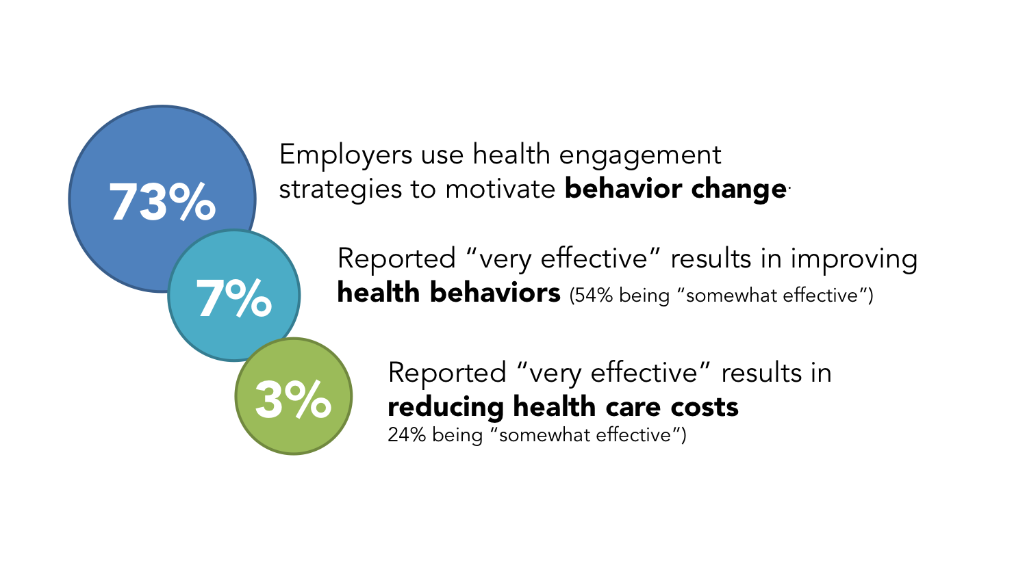
A COMMON PROBLEM
Many companies have realized that this can play a big role in controlling costs of employee healthcare. However, most are not confident that their strategies are effective. So - why is it so difficult?
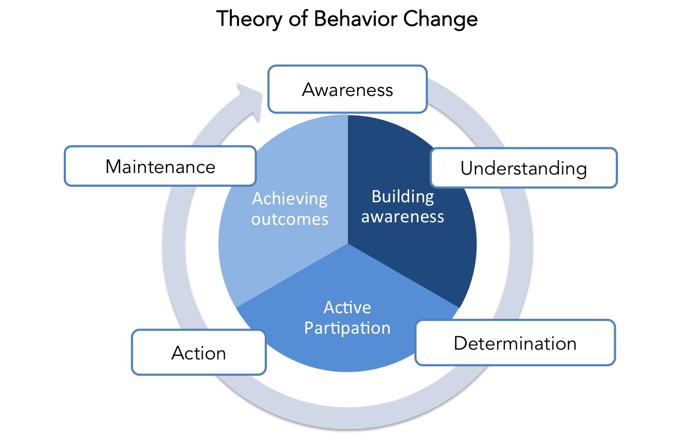
PSYCHOLOGY OF BEHAVIOR CHANGE
We researched psychological theories of behavior change and found that awareness and internalization of knowledge are two foundational components of behavior change. Before people can make difficult changes in their lives, they first need to understand why there is a need for a change at all. We all know from New Year's Resolutions that this is a difficult process.
SYNTHESIS
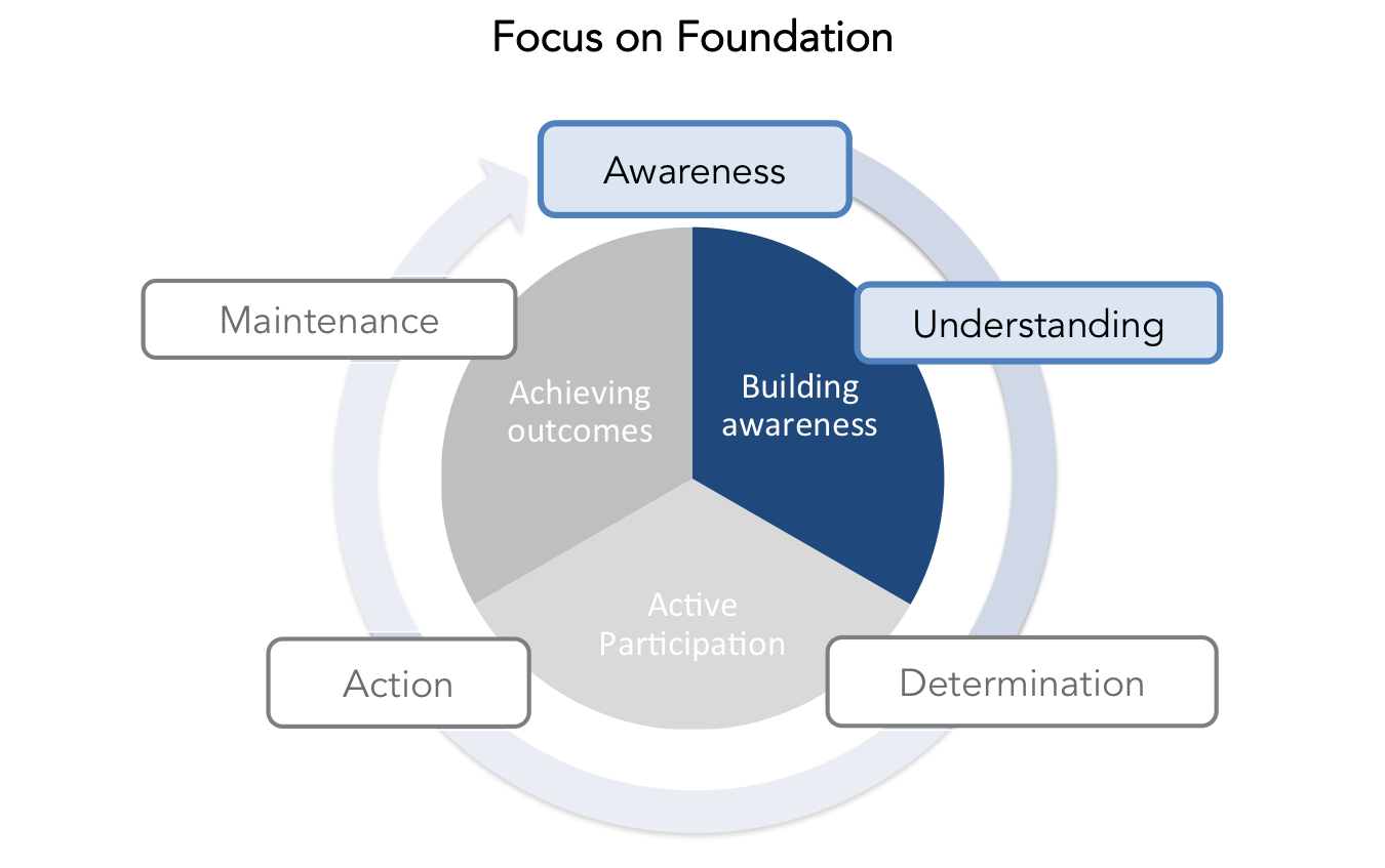
Since this is the first time employees will have access to their own health metrics - we decided to position our employee health portal design as an introductory tool that focuses on increasing awareness & knowledge about personal health (rather than an data analytics focused platform or "health diary" portal).
Another way of thinking about this is from the business perspective. Ultimately, the client company wants to see increased production and decreased health costs - but before we can even think about concrete ROI, we first have to have employee engagement - and engagement begins with awareness.
We recognize that behavior change is a personal process. Health & wellness strategies are not 'one size fits all.' So we will need to design the health portal specifically for our target users.
USER ARCHETYPES
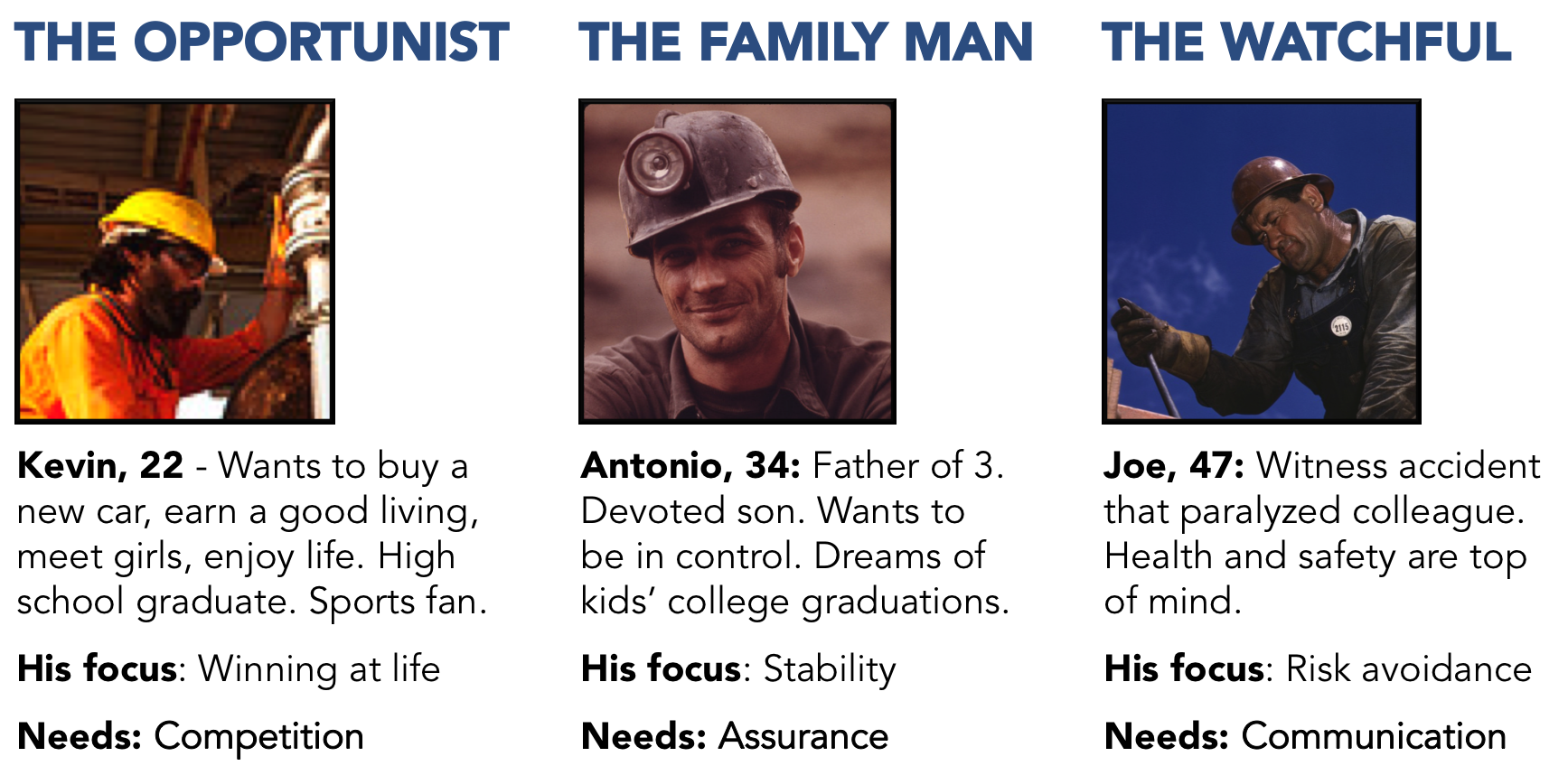
This was an unusual and challenging project because we could not contact any actual users of the employee portal (e.g. Gold miners in Argentina), forcing us to get creative to learn about our users. We:
- Interviewed local construction workers,
- Talked to friends with families who work in the Latin American mining industry
- Met repeatedly with Bridgecrest employees who have met with the target users.
- Read field-study research papers on Latin American mining culture.
Based on this research, we developed different user archetypes that we feel serve as a good starting point.
Technical constraints
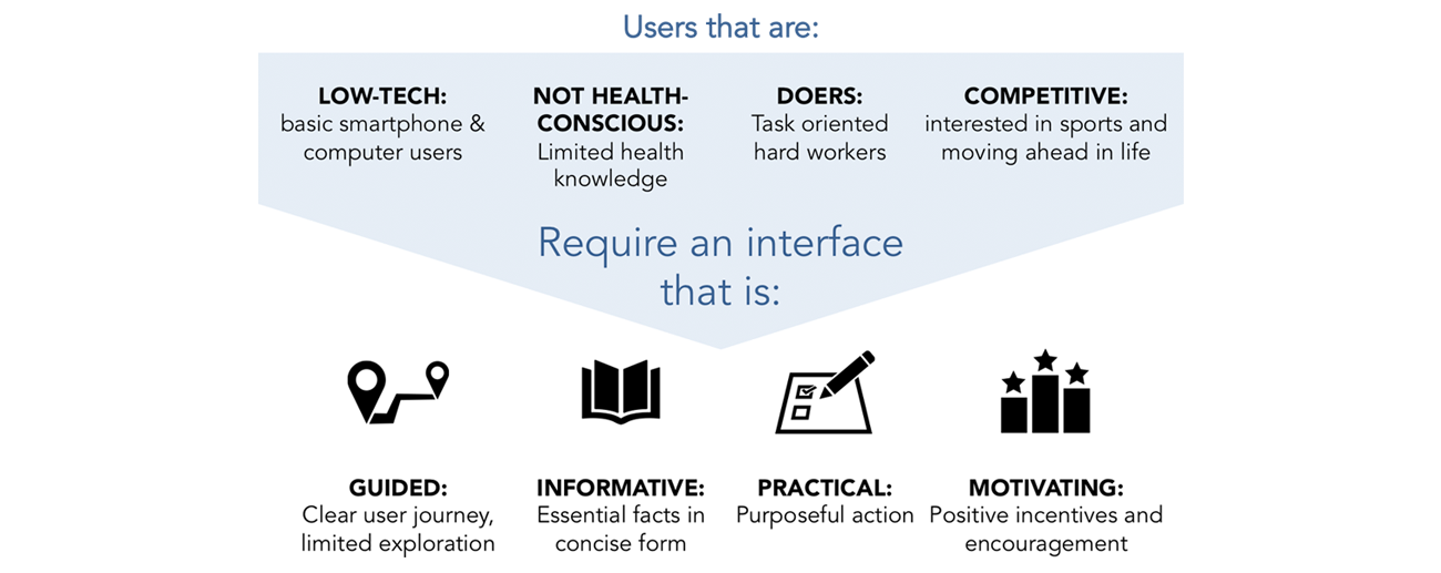
We learned that most of the miners have a smart phone and access to public or company computers, but generally have low-tech lifestyles. They mostly use their mobile phones for phone calls and computer access for emails. Although mobile phones are more easily accessible for the miners (especially for mining sites in remote locations), it was unclear how reliable the cellular network service is in these areas. Based on this, our clients requested that we begin with a web-based portal.
DELIBERATE DESIGN framework
We came up with a deliberate design framework to help us navigate our design decisions. We distilled our user archetypes down to 4 defining characteristics that captured the personality and needs of our target users. Based on these characteristics, we brainstormed 4 traits that we wanted our interface design to embody:
INSPIRATION & COMPARATIVE ANALYSIS
We found inspiration for each of our 4 deliberate design traits (guided, informative, practical, and motivating) from existing health monitoring or motivational products. For each design trait, we identified examples that were effective and ones that were ineffective. We were also able to communicate our ideas to our clients more clearly with the use of visual examples:
SKETCHING & ITERATIONS
We started by sketching out as many different ideas we could think of to display data and health information. Most of our initial sketches contained too much information (not guided or practical). Several iterations were needed to simplify the visual layout, the information, and the user flows to match our deliberate design considerations. We also conducted usability testing to understand which types of visual displays of data were the most intuitive and informative.
WEB PORTAL SOLUTION
The most challenging aspect of the employee health portal was making it both non-intimidating and motivational for users who are unaccustomed to health data and web conventions. Using our deliberate design framework (guided, informative, practical, and motivating), we specifically tailored the user journey, the visual display of data, and the navigation of the website to our users.

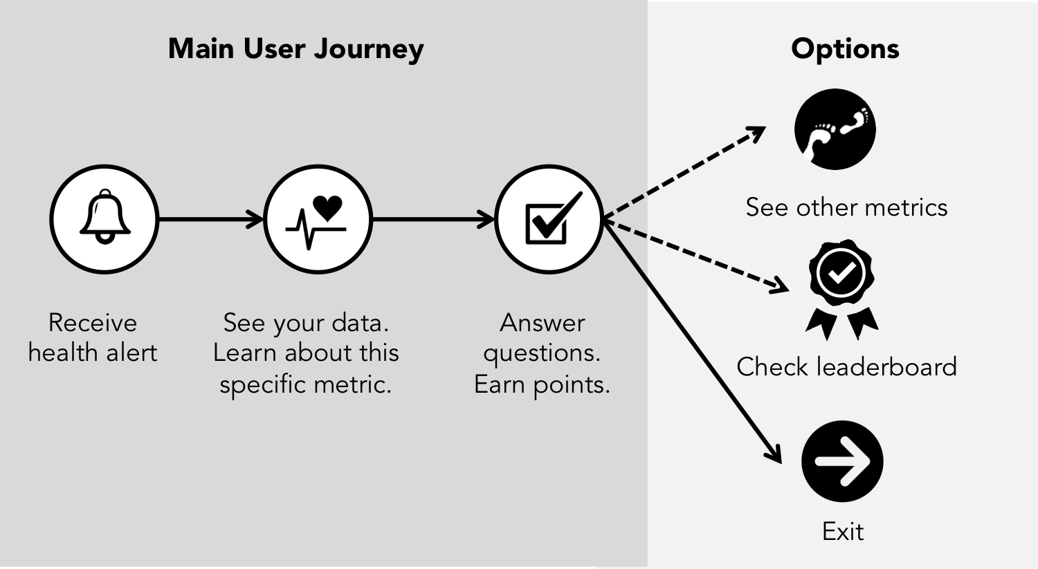
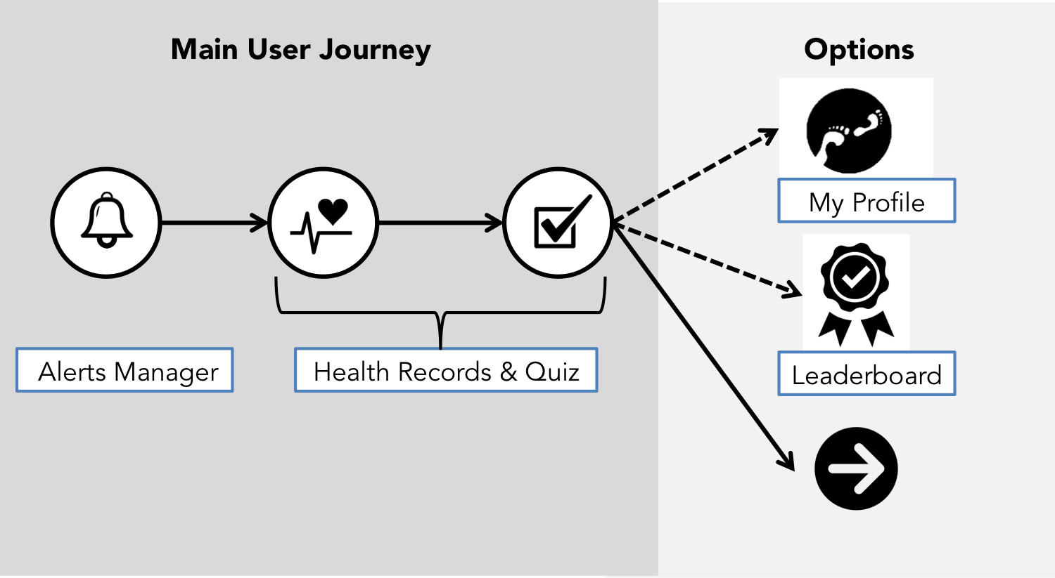
SIMPLE USER JOURNEY & GUIDED VISUAL FLOW
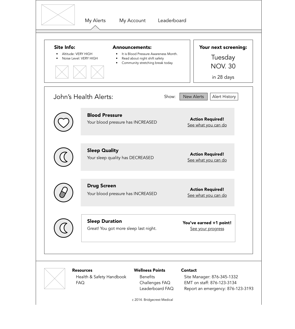
We designed a simple user flow that is triggered by a health alert, which directs them to their health metrics page and knowledge quiz. Once the user has completed the quiz they have completed the user flow.
Users always have the option to explore the leaderboard or their other health metrics.
Using page visit analytics on how much time users spend in the “essential” flow versus the “optional” flow is an example of user data that can be informative about trends in health awareness and interest.
We also designed the visual layout of information to have a clear flow on each page. We wanted to use a repeatable visual pattern of information for each health metrics page so that the users can become familiar with the type of information found on certain locations of the page.

INFORMATIVE FACTS & DIGESTIBLE DATA
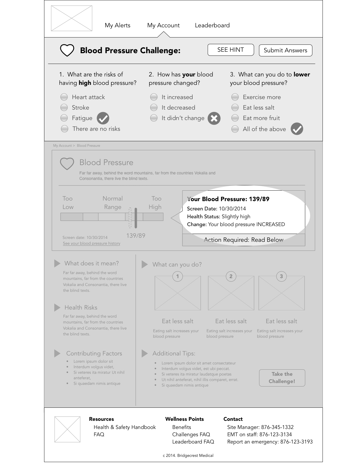
Each health metric that is recorded will have its own "health fact sheet." (Examples: blood pressure, sleep quality and quantity, respiratory health, hearing quality, etc.) It will be essential to have a medical professional provide concise and relevant information for each health metric page.
We were conscious of the fact that data can be easily misinterpreted if the data visualization is not designed accurately. We recommend usability testing with a variety of users and medical professionals to make sure that the data visualizations are accurately intuitive, keeping in mind that different metrics may be better communicated in different ways.
We wanted to summarize the health data in a concise and digestible way. Instead of displaying all data measurements ever taken (which can appear overwhelming), we identified 4 key pieces of information to display from the health data:
- Latest measurement from monthly health screening results
- Relative change from previous measurement
- Comparison of latest measurement with "normal healthy range"
- An interpretation of current health status

PRACTICAL LEARNING
We included "open-book" knowledge quizzes that encourage practical learning. The quiz questions can target awareness and knowledge of:
- Health facts
- Personal health metrics
- Health and wellness tips
The hints are shown in a visually stimulating way to make looking for the right answer easy.

POINT SYSTEM & LEADERBOARD
We included a simple point system and community leaderboard as a part of the gamification element of the portal. We recommend two types of goals – individual point challenges (all users who have a certain number of points by the end of the challenge time frame wins) and community leaderboard challenges (the user who has the most points on the leaderboard wins). Based on our research, we found that it is important to limit the time frame of challenges and to frequently change the goals in order to maintain interest.


JUST A LITTLE BIT ABOUT Mobile CONSIDERATIONS
After we showed our clients the web-based portal, they mentioned that they were interested in eventually building a native mobile app for the health portal. So we spent a little time thinking about how we might translate our "guided-informative-practical-motivating" web portal into a mobile health portal. We quickly realized that a mobile interface or a mobile-first design approach is particularly appropriate for our users since mobile-first forces you to really prioritize core content and functionality.
The mobile app user flow would remain the same as the web portal. The main differences would be in the presentation of health information and in the quiz functionality. We turned our "Health Fact Sheets" into "Health Flash Cards," each featuring a key piece of information.
At this point, we would need concrete user feedback to know which design to pursue further. It is likely that we would build a second iteration of the web portal using a mobile-first design approach.
Translating main user flow from web to mobile. The main difference is that each "module" of the health info sheet is now its own "flash card" mobile screen. The user swipes through the flash cards to get to the quiz challenge. The mobile screens for the Alerts Manager, Leaderboard, and My Records maintain a similar structure as the web pages.
"Flash Card" Style information presentation. A mobile version of the health portal is even more conducive to a "GUIDED" experience - walking the user through each key piece of information. Since there is no room for all the information to be visible while taking the quiz, an overlay with hint cards may be an alternative to the "open-book" nature.
NEXT STEPS: USER TESTING & ITERATION
Our design serves as an initial starting point for further iteration based on user feedback (usability testing, surveys, interviews) and user traffic data (page visits, duration, challenge points). User data can be used to gain insight into behavior and attitudes towards health & wellness, which can then be used to adjust the interface design, mobile strategies, and motivational incentives design.
NEXT STEPS: SCALING UP
We designed the initial scope of the employee portal to focus on awareness and knowledge goals through individual and leaderboard challenges. However the scope of the health portal should grow over time to target different types of goals with increasing community level involvement.
As employees become more knowledgeable about their health metrics and more familiar with the health portal, the goals can begin to address later stages of the behavior change model (determination, action, & maintenance). In addition, the community support and team challenges can be incorporated to promote a more holistic culture of wellness.