THE MAGIC TOY SHOP
E-COMMERCE WEBSITE DESIGN
Client: The Magic Toy Shop | Length: 2 weeks
THE BRAND:
The Magic Toy Shop specializes in sourcing the most cherished items from everyone’s childhood, making long-forgotten things available today - as if by magic!
THE CHALLENGE:
The objective was to understand and implement the design process for building an e-commerce website to help a hypothetical toy shop create an online presence that maintains their traditional values and boutique personality.
THE SOLUTION:
My design focuses on infusing the website with functional attributes of a physical brick and mortar shop. I also analyzed the personas to identify what makes a "satisfied customer" and included specific features to cater to them.
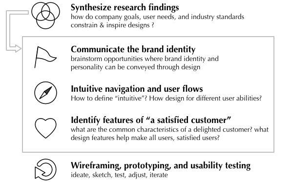
RESEARCH & DESIGN APPROACH
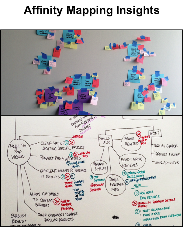
Based on the research materials provided to us about the company and its users, I created concept and affinity maps to understand how their personalities, needs, and priorities overlap. I identified three main design priorities:
PERSONALITY
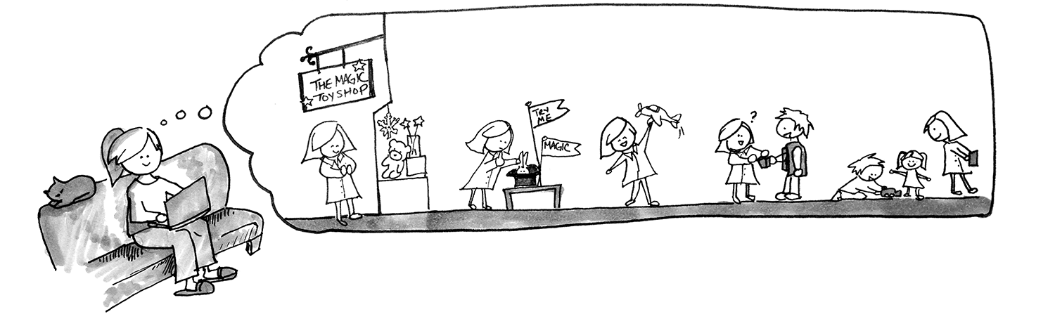
Maintaining the personality of The Magic Toy Shop is a top priority for the brand as well as for its customers, who are drawn to its small-shop feel, hand-picked quality toys, and personalized service. I visited several local boutique toy shops to understand how the brick and mortar toy shopping experience.
The toy shops that I visited offered endless opportunities for sparking imagination, creativity, and exploration. It was an inviting experience. The customers floated around the shops, investigating the unique sections of toys, playing with them, and interacting with shop staff and other customers. I decided that I wanted to create a design that was reminiscent of a brick and mortar toy shop - not only in appearance, but also in functionality. I began sketching ideas for how to accomplish this in wireframes:
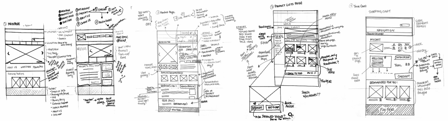
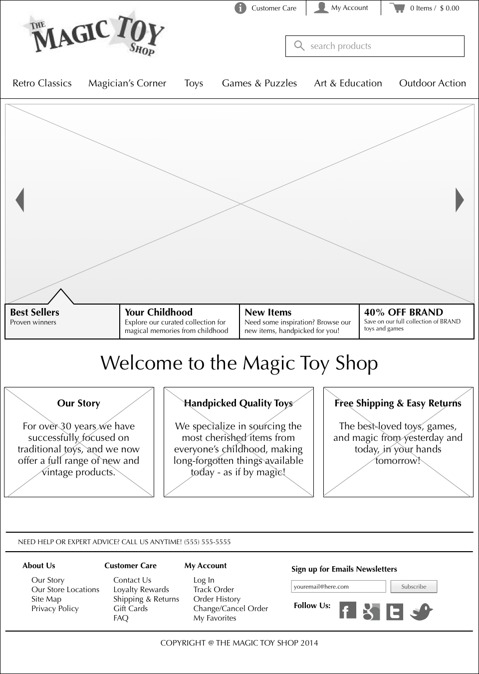
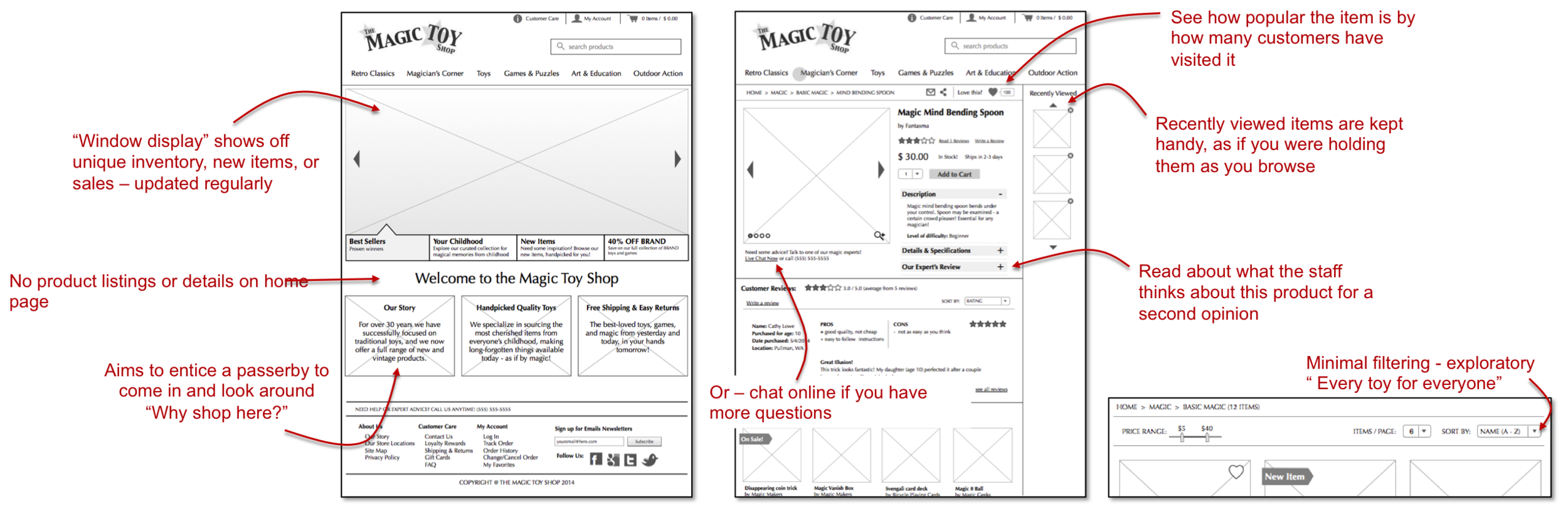
I wanted to make the interface look crisp but not too modern. My final design tries to embody a traditional brick and mortar shopping experience by providing similar affordances in the interface:
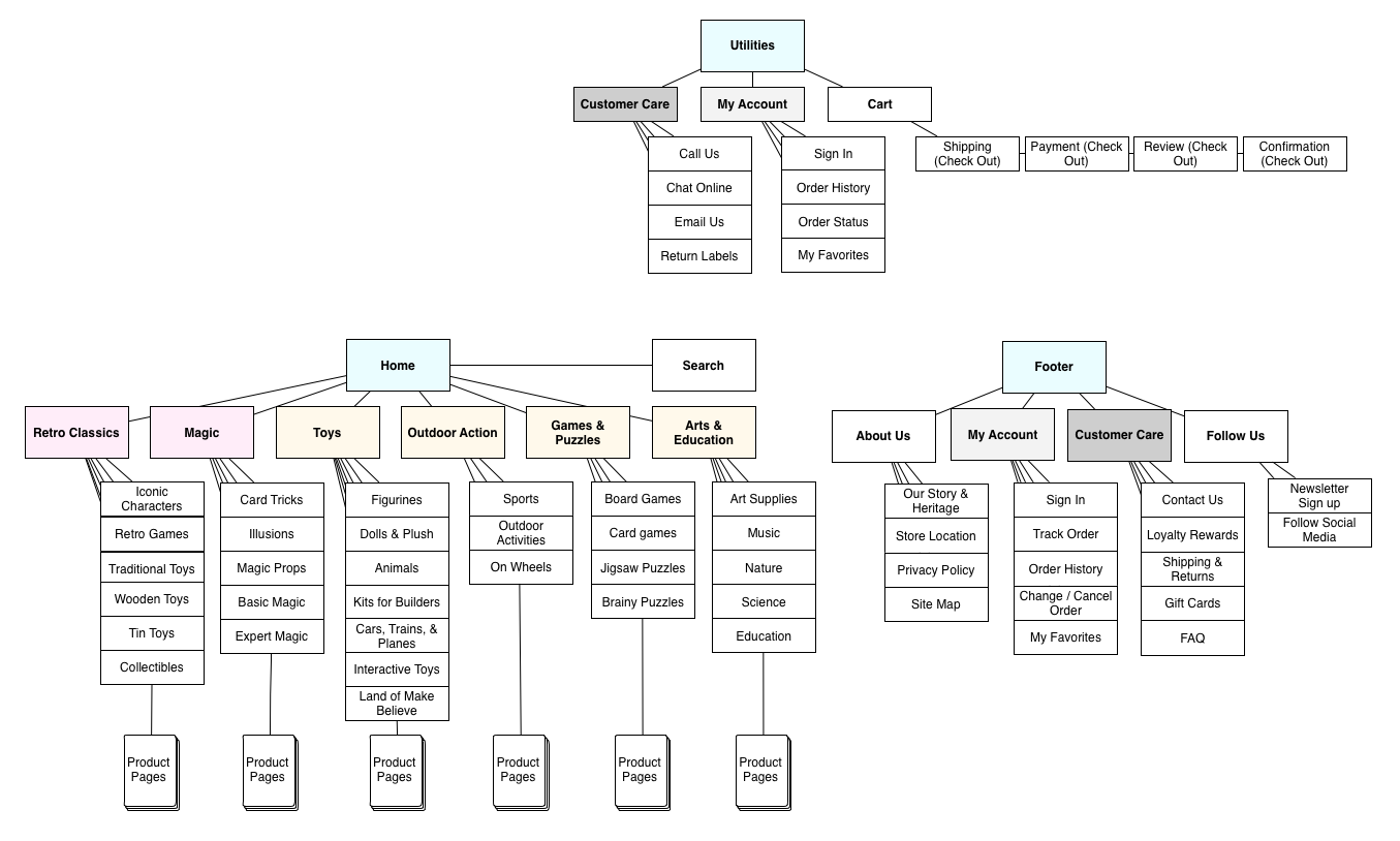
ORGANIZED FOUNDATION
Another key design priority was ensuring that the inventory items were organized in a clear and intuitive way. The Magic Toy Shop has a diverse range of inventory and specializes in providing hand-picked, high quality toys to both children and adults.
The product categories needed to be intuitive for shoppers while still showcasing the toy shop's specialities. Two of the main categories were set to feature "Classics" and "Magic," while the other product categories were determined after observing multiple cardsorting of the top 100 best-selling products (both in-person and online (n = 82 participants)).
CLEAR USER PATHS
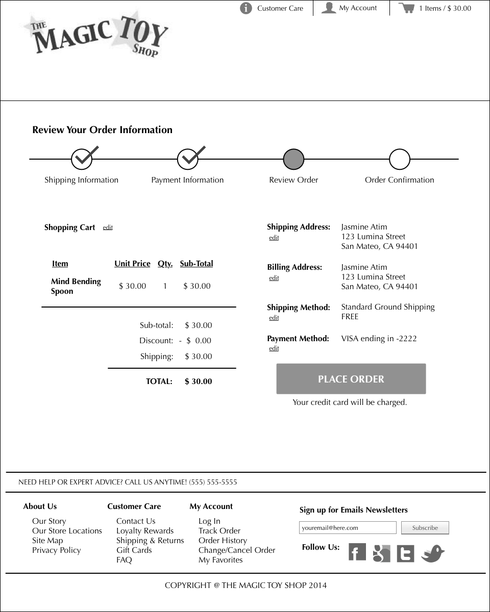
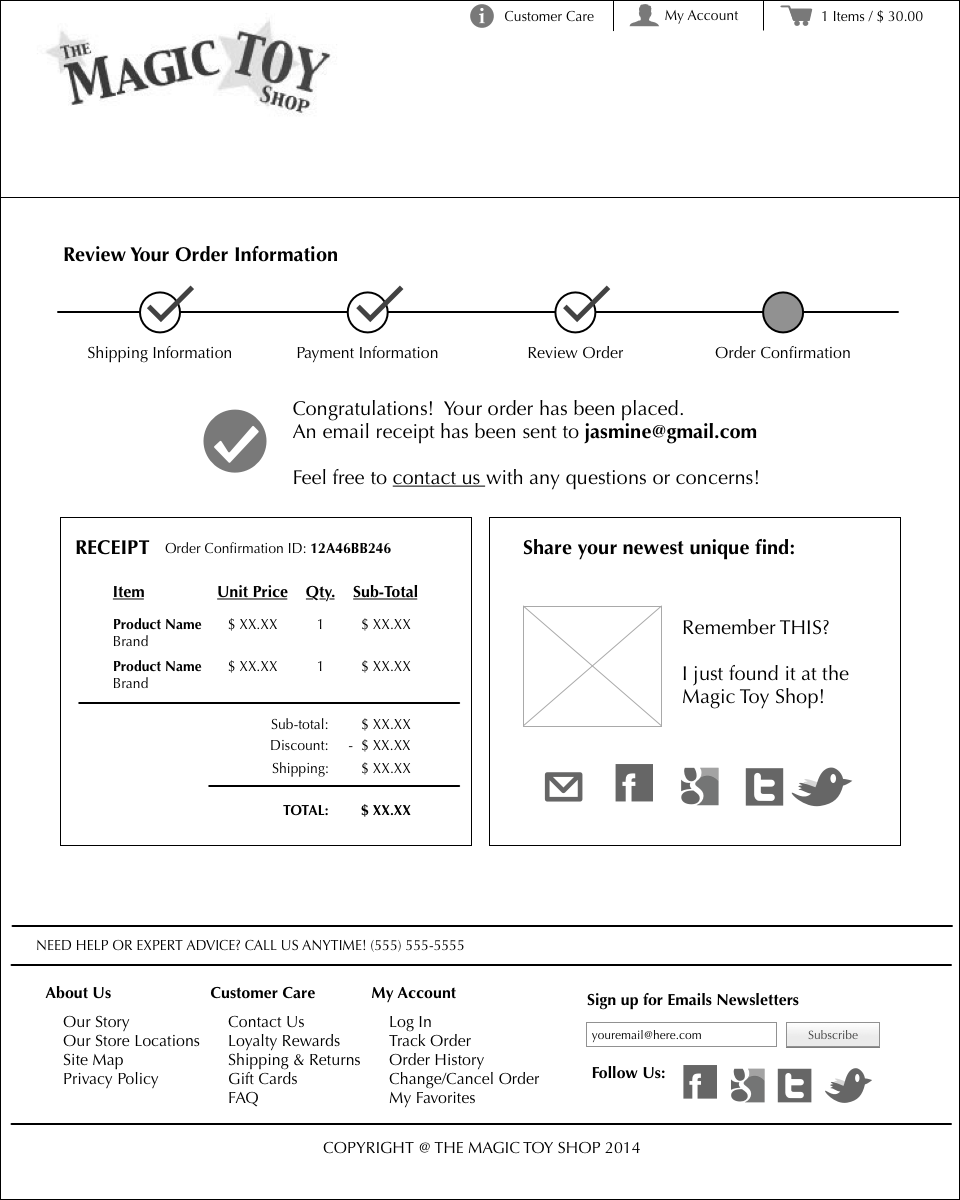
I created a generalized user journey map depicting 4 main user flows involved in making an online purchase.
Now the website is structured and organized... but what makes it delightful and satisfying?

CUSTOMER SATISFACTION

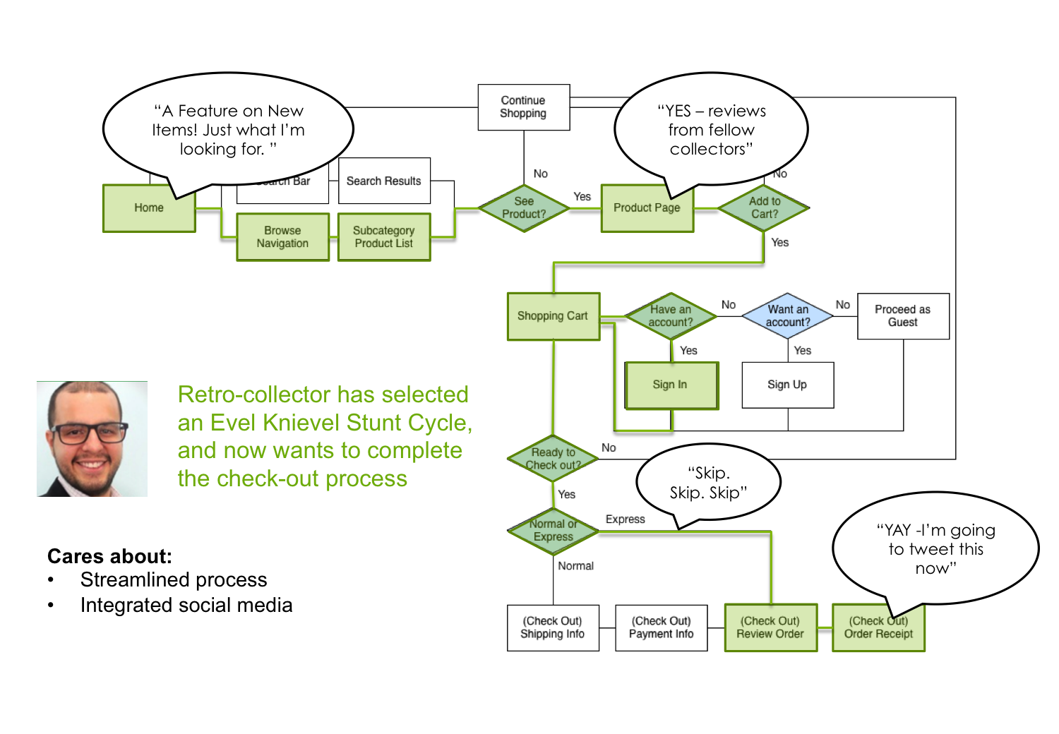

To gain a better understanding of what makes a "satisfied customer," I followed each persona through their "happy path" on the user journey map. Based on their personalities, needs, and tech savviness, I tried to imagine what each persona was thinking along each leg of their journey to get a better understanding of what it is that makes their happy path, their happy path.
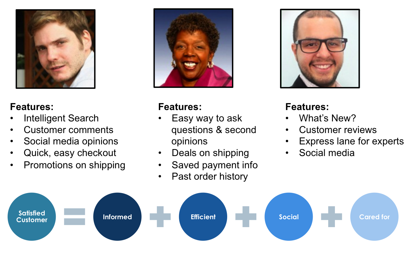
I identify 4 traits of a "satisfied customer" based on these user personas. A satisfied customer is one that is INFORMED, EFFICIENT, SOCIAL, & CARED FOR.
I then included features throughout the website that catered to these traits.
INFORMED CUSTOMERS

SOCIAL CUSTOMERS SHARE

EFFICIENT CUSTOMERS
CARED FOR CUSTOMERS

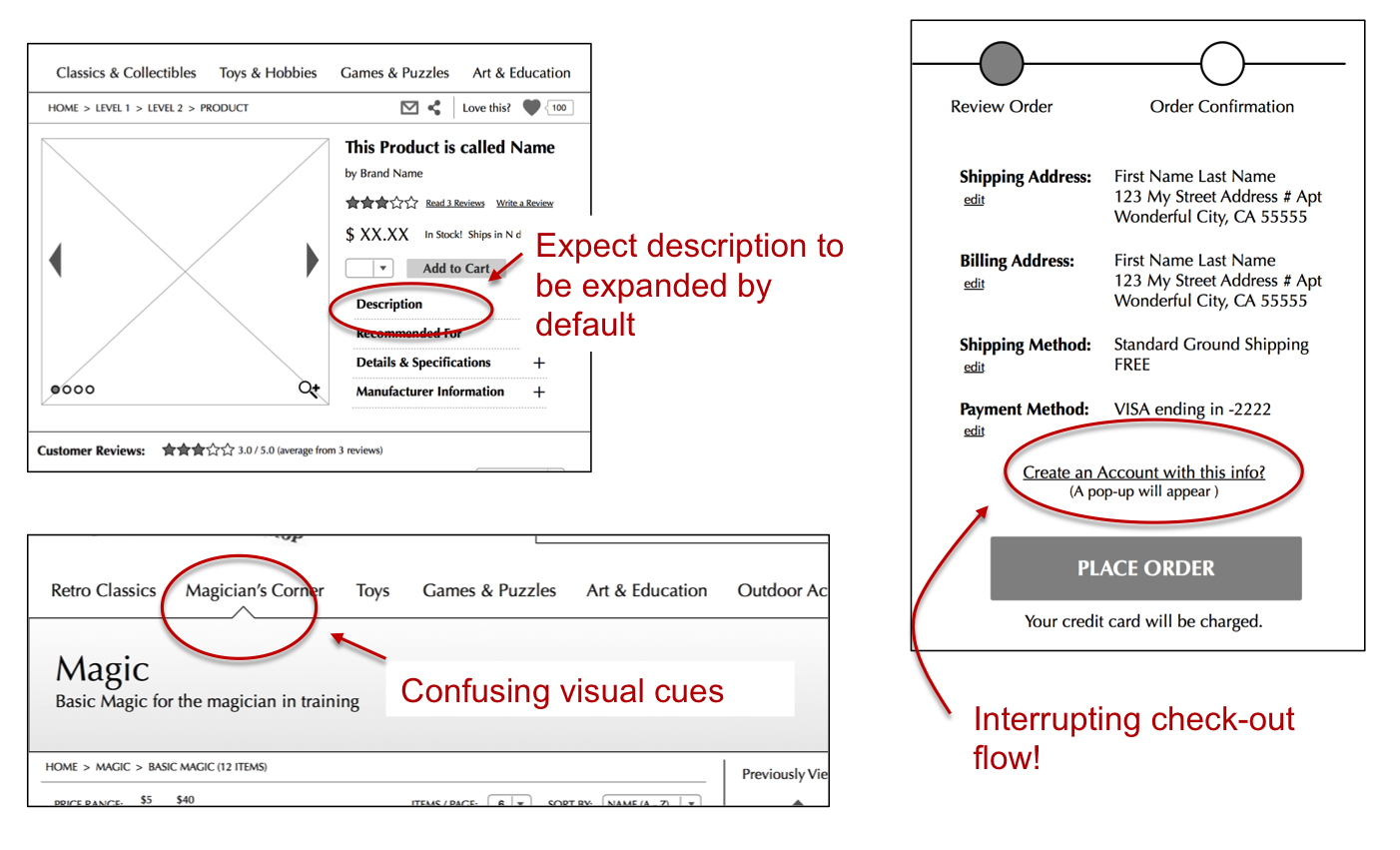
USABILITY TESTING
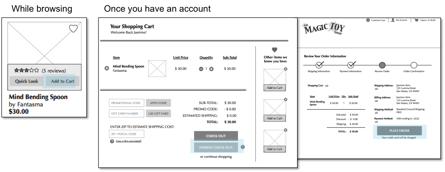
I created an interactive prototype in InvisionApp and conducted some user testing. Insights from usability testing helped me eliminate points of friction and confusing visual cues.
See the prototype here: